JIM MCFARLANE – NOT ONLY A HORRIBLE ARTIST BUT, A PLAGIARIST AND THIEF AS WELL

Untitled copy

This watercolor artist is so bad that it’s almost a waste of time to talk about him. He’s not a versatile artist in that he only paints one subject with only one medium…..a weekend artist. I hate artists like that…..not very important as a viable working fine artist…..an amateur!  There are also several artist’s blogs that talk about all the corruption in art societies in America and this guy is mentioned many times. He is now known as the thief who was in charge of the American Watercolor Society at one time. This explains why that society has lost all the great notoriety it once had. It is now known as a failed society!

The most famous incident is when, as the president of the American Watercolor Society, he accused a very famous artist of plagiarism. The artist in question got an attorney and proved that accusation to be false. However, Mr. McFarlane didn’t abide by that information and decided that he was going to keep the artist’s money! He never returned that artist’s award that was taken away from him. McFarlane literally stole the artist’s money and probably placed it into his own bank account not telling the AWS! When the artist contacted McFarlane many times to get it back, as anyone would have done, McFarlane had the next President (Antonio Masi) and the Vice President (Joel Popadics) cancel the artist’s membership to keep the artist quiet! When the artist asked them why, they gave him no reason….that’s illegal!!!!!! Nice guys huh…this is criminal! They most likely did that as a favor to their very good friend McFarlane. If any of you are thinking about becoming a member of this corrupt society, I would think twice about that. The AWS has many problems now with corruption and ethical issues from their top officers!!!! Not only is McFarlane a thief, but his moral character is also in question!

mcfarlane 2

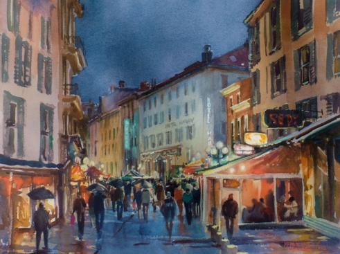
This is one of McFarlane’s horrible watercolors. The values of all the colors here are all the same thus becoming very boring. If you notice, The sky and the sidewalk are the same color and density. One of them should have been lighter. Because the sky is so dark, he should have made more contrast in the painting by making the buildings lighter to accomplish that. Right now, there is no contrast because the colors are the same value. 

Also, if you notice, the perspective  is off on the buildings on the right. If you lay a pencil on the lines of the roof of the buildings in the middle, you can see that on the sienna building to the right, the yellow sections of the roof are not lined up. The same is true on the pink building on the left. All the balconies are pointed downward. That would never happen! Id though it’s a loosed watercolor, you should at least show that you understand perspective.

I have to say that this artist work on his site is just about he worst group of paintings I have ever seen. As it turns out, McFarlane is also talked about on another site called “Bad Watercolor Artists” next to his site on the internet……och, but, well deserved! His paintings are so bad that he resorts to plagiarizing paintings in order to come up with something that looks nice. If you are thinking about buying one of his paintings….don’t….it just may be a copy of another artist’s painting! They are so badly done that they will be no value in the future. Believe it or not, this guy also teaches workshops so, if you are a beginner, I wouldn’t consider taking lessons from an artist such as this who is obviously so horrible at watercolor painting. You will learn nothing….save your money!!!! Also, if you are on a workshop committee, you should look for other more viable artists to teach your students. This artist is an imbecile and has nothing to offer anyone!!!!!

NATASHA ISENHOUR – A REALLY HORRIBLE PASTEL ARTIST

In order to teach teach young beginners in art how to paint correctly, I picked out some artists working today who do it all wrong when it comes to creating a successful work of art.  This is an artist who would have been a better sculptor than painter. This alleged artist is also the kind of person the Pastel Society of America selects each year to be on their Hall of Fame Honoree list….horrible, which says a lot about that failed society!  If you look at any of this woman’s pastel paintings, you can see right away that there is no indication of the ability to draw. This in turn will make all her paintings look amateurish in nature. If there is no strong foundation, the entire painting will collapse and will never succeed! I selected several of her pastels to illustrate how not to use this medium in painting.

isenhour 2

Everything about this painting is wrong. It clearly shows that there is a lack of knowledge of art principles and elements needed to have a successful painting. Perhaps she didn’t attend any fine art school to learn these principles or, she is a self taught artist. Then again, maybe she did attend an art school, but didn’t pay much attention! What ever the reason, this pastel appears to be painted by a child. To me, it seems to be a study or, at the very least, a foundation lay-in of colors for a finished rendering to come later. To Ms. Isenhour, it’s a finished painting. I’m not exaggerating….my granddaughter painted better than this when she was ten years old……really! I still have her painting!

The first thing I noticed here is that there is a abundant use of black and gray in this painting. There never is solid gray or black in any landscape. To indicate the color of a gray looking object, you should always use a combination of colors together to indicate this. An example would be a light blue and burnt sienna used one over the other. This in turn, will add life and interest to any painting. Isenhour literally picked up a gray pastel and used it alone. An example would be the mountains in the distance, which should never be indicated as the color gray. Any good artist would know that because of the distance from the foreground to the background is composed of air….mountains in any painting would contain the color blue. This in turn is called “aerial perspective”. It makes objects recede in the distance from what is in the foreground.

This next thing I notice is that the application of the pastel is rather clumsy. It appears that everything is rubbed instead of applied as strokes of color in nature. Because of this, there is no delineation of one element from another. Case in point would be that the viewer can’t tell where  the base of the bushes in the background ends and the land area in the foreground begins. You can see how they simply blend together on the left center of the painting.

All in all, this painting is very poorly constructed and shows a lack of artistic knowledge by the artist. Because of this, this particular pastel looks very sloppy and amateurish in nature. It is a complete failure!

isenhour

Next, we have a pastel of a bird flying. Anytime you see a subject such as this, a red flag should go up. Unless you are a professional photographer of wild life, it is virtually impossible to take a photo of a bird flying. You would have to have a telephoto lens and the knowledge needed to be able to take a reference photo such as this. Knowing the history of this woman, I would say that she didn’t take the reference photo for this painting, but took the image from some other person’s photo. This in turn is called “plagiarism”. I would be very careful that you do not do this while painting. I know that it is tempting, but if you do something like this, your reputation as a respected artist will not exist. Also there will always be vicious mean-spirited people out there who are only too willing to put other people in their place! They will actually email presidents of art societies and editors of art magazines with the purpose of ruining your career so, beware! Always take your own reference photos, and or, paint from life. This is called “plein-air” painting. Do not steal a reference photo from another artist as it appears Ms. Isenhour did!

Once agin, the color gray is used as definition in the birds wing and tail. Instead, a light shade of blue mixed with the gray should have been used because of the color of the sky. This is called “reflective color”. Also, the value of the blue should have been a little darker around the bird in this painting to create a separation between the bird and the sky.

Along with the horrible work this artist creates, she also has a reputation of going after other fellow artists for either saying things she doesn’t like or, for petty jealousy issues. There are articles written about the malicious deeds of Ms. Isenhour on the blogs of several well known artists. As I learned for this blog post by speaking to an artist who had an unfortunate experience with Ms. Isenhour, the most famous incident involves Isenhour and one of the better fine artists in America.  It seems that several years ago, this woman and her best friend (Margi Lucena) decided that they were going to get this famous artist fired for writing an art column for a prestigious art magazine. I mentioned this scenario above! Isenhour apparently didn’t like hearing the truth about what this artist said concerning a really bad piece of art. I guess Isenhour never heard of the First Amendment and freedom of speech. It was simply an observation about how to make this artist’s work better! Instead of contacting the artist who made the comment to express her dislike of what was said, she decided to email the editor of an art magazine this artist was a columnist for and go behind the artist’s back and try to get him fired…spiteful and vindictive! She also enlisted the help of her good friend to also send an email to make it look as if her argument was stronger. Isenhour and Margi Lucena failed in their attempt to get and pay back this great artist thanks to the great incite and recognizing pettiness from the magazine editor. What these two did is now well known  in the art community!

A tip from anyone thinking about purchasing a painting from this painter would be to be forewarned. The quality of her work is horrendous and there’s that little problem of plagiarism to consider! All that combined with the obvious problem with her moral character, I would not consider buying anything from his artist only because the value of any of her paintings will only decline in the future!

ANTONIO MASI – AN ARTISTS WHO IS NOT VERSATILE PAINTING WITH ONLY ONE MEDIUM

This watercolor artist is so bad it’s hard to even begin to find something to say that’s positive about his work. The first thing that sticks out like a sore thumb is that Mr. Masi is not a versatile artist in that the can only paint one subject with one medium….bridges….the same bridge over and over again. This is not only boring, but it’s not good for an artist for so many reasons. To be a successful prestigious artist, you have to be able to paint many subjects (landscape and figures) and to use several media to accomplish that..…this guy has no versatility! He simply does not have the knowledge to do that. That is not what I consider to be a viable artist that anyone should pay attention to. Let’s study his work!

masi

This is a horrible painting on many different levels. At first glance, this painting looks as though a child created it. There is a total lack of correct drawing in this lackluster painting. The couple depicted in the foreground is poorly drawn! Even for an indication of people on a stormy day, there has to be some sense that the figures are real …a man and a woman. To me, they look like two blobs of black color…nothing else. This indicates immaturity in the artist. Either he doesn’t know how to draw or, he rushed to paint in these two elements…..probably both after looking at his portfolio!

The next thing I noticed is that there are too many direction lines going on here. The couple leans to the left whereas the tree leans to the right and the arch goes straight up. There is no assemblage of order….very confusing and busy.

The next thing to notice is that even during a rain storm there will be more color indicated than just gray. By the use of only gray and a touch of yellow ochre, this painting become very boring. All things considered, this is a hideous painting.

masi 2

 This is a type of a bridge called an aqueduct. It was used centuries ago for conveying water from one spot to another. The painting itself is a mess. There is too much of Masi’s technique indicated here and not enough attention paid to the subject. By that I mean that the artist used too many dripped lines on the subject depicted and it takes way from the beauty of the structure. He didn’t need to add all those drip lines. He got too cute!

Also, Mr. Masi apparently doesn’t know anything about perspective and correct drawing. If you look at the bridge on top and bottom, the columns seem to be leaning to the left. From this perspective on the ground, the columns on the bridge would still be straight….not tipping to the left.

Lastly, The color yellow in the sky is all wrong. Because the color used in the bridge was burnt sienna, the sky color should have been more of lighter shade of burnt sienna or raw sienna to go along with the bridge itself.

Because of the incorrect drawing of the bridge and the wrong selection of color for the sky, this painting does not work. It shows a lack of knowledge of linear perspective and the use of color. Because of this and the fact that he can’t paint figures, I consider Mr. Masi not be a prominent successful artist in the art community today!

As a side note, I have heard many stories from other artists that Mr. Masi, has a lot of jealousy issues. As president of the American Watercolor Society, he will kick out any artist from that society for no apparent reason. This could only mean that he shows petty jealousy over the talent of any artists better then he is. As an example, it is well known that the past president (Jim McFarlane) of the failed AWS stole some award money from a well known artist. I talked to this artist and got the facts before writing this article. When this artist complained about it, McFarlane  got Masi and the Vice President (Joel Popadics) to cancel the artist’s membership as a favor to get rid of this artist. When the artist asked about why this happened, Masi and  Popadics refused to give him an answer. What this means that there was no reason. This is illegal and they can be sued at any time!!!!! All this about Masi’s sordid past has been well documented in articles in society newsletters and artists’s blogs.

Because of this artist’s lack of talent and his moral character, I would advise you to not consider buying anything from him. He is a failure in so many ways and the value of his work will only depreciate in the future! I also think that the American Watercolor should ask he and Popadics to resign because of their corrupt behavior. This is what should be done, so I know right away that it won’t….too political and everyone is afraid!


RAE SMITH – AN ARTIST WHO’S NOT VERSATILE SO SHE PLAGIARIZES

This is an artist that has nothing going for herself. To me, her pastels always looked like another artist’s work……. as if I’ve seen them before somewhere. As an artist you should never follow any artist’s technique so closely that your work starts to look like that artist has created them. You can learn things from looking at artists work, but not take everything from that person. You should come up with your own technique, otherwise, it looks as though you’re plagiarizing!

Several years ago, Ms. Smith entered one of her pastels into her own show, being that she was the president of the Pastel Society of America at that time. This should never happen because it screams of favoritism! All artists who are not that talented always become officers in art societies to get some notoriety because they can’t get that by showing their work to the art community! Jimmy Wright (president of the Pastel Society of America) is a great example! In this particular exhibition, she was involved with hiring the Awards Judge. When the awards were presented, guess what happened, she won the Best in Show Award. This is a classic example of favoritism. It is the worst case of this I have ever seen.

On top of that, the painting that won her the award was copied from another artist’s work. A copy of the artist’s painting along with her version was published in several pastel art society newsletters. Also, the story about this issue was placed on two artist’s blogs…..it’s common knowledge that she is a plagiarist! Therefore, she won the top award for a painting in her own society show she took from some other artist. The PSA was told about this issue but, they did noting about it because she has a lot of friends there. This is an illegal issue and should have been taken care of. It’s exactly like Hillary Clinton getting away with committing at least 45 felonies because she is good friends with Jim Comey, the head of the FBI at that time! This tells me that this corrupt society is biased and does not care about their artists being involved with plagiarism or favoritism. This is a society you do not want to join or be a part of because of they’re moral character!!!!!! Now, let’s look at this plagiarist’s work.

smith 2

This pastel is absolutely hideous! Because of the somber drab color scheme, there is no excitement or interesting elements to look at. Instead of using monochromatic colors in the dark reflections, she could have used some olive green from the bushes on the shore, which should have been green too. This would have made that color complimentary to the purple color of the lighter section of the water.

To add even more color to this painting, she could have made the two boats difference bright colors such as yellow, orange or red to make those elements stand out as the center of interest. Along with that, the boat on the right is not drawn correctly. It appears to be resting on an object in the water that makes the front of the boat rise up. The issue here is called “foreshortening”. By looking at the perspective of the boat on he left, the viewer of this painting shouldn’t be looking down onto the other dinghy as much. The front should be lowered slightly so the viewer s looking across the boat instead of down on it!

smith

This is yet another one of her paintings that doesn’t work! The first thing I noticed is that every section of this painting is equal, which is not good. To make any painting more correct and interesting, the space between objects should be different. If you look at this pastel, the shoreline and each of the three rock formations going out in the water are the same distance from one another. There should have been different spacing between them.

I mentioned that Ms. Smith often copies other artists when she paints. To me, this water scene looks like she was looking at a very famous painting by Claude Monet when painting this one. It depicts the same color scheme and direction of the mist on top the way the master artist painted it. However, Monet added more olive green everywhere to pull his painting together. He knew what he was doing….this artist didn’t! There should have been lighter shades of green in the water in the background and darker shades of green could have been added on the shore at the bottom on the right.

Because of lack of knowledge concerning color and drawing along with her sordid past of plagiarizing paintings, I would not recommend purchasing any work from this artist. It certainly will not be valuable to anyone in the future!!!!!!

DEAN MITCHELL – A PLAGIARIST AND OVER-RATED ARTIST

Whenever I look at this guy’s paintings, I have the awkward feeling that I have seen this technique and artist’s vision somewhere else. Then, it hits me….all his work looks exactly like the master Andrew Wyeth painted all of them. It’s obvious that Mitchell admired Mr. Wyeth a great deal, but as an artist, you never copy everything you see from another artist as Mitchell did….he took way too much…..even his vision as an artist!!!!! 

Every artist had a mentor….some artist whose work they admire however, you learn how to define areas or how to use color correctly from these artists. You do not take everything, including the artist’s subject matter, color schemes, design set ups and techniques as Mr. Mitchell did with Mr. Wyeth. If you do, it makes you appear to be a plagiarist. All these years and nobody ever said a word about this unprofessional decision on his part. Mitchell is and African American, which makes me think that he got a free pass….to criticize him would make it seem that you are a racist…. not politically correct to do so!  I’m sure this is how the little elderly women who are the presidents of most of the societies in this country view this! That’s the way societies in America are being run now….terrified to be called a racist! An example would be when Jimmy Carter said, “Anyone who disagrees with Obama is a racist!” What….really!!! Anyway, let’s look at some of Mitchell’s work where he copied Andrew Wyeth. 

mitchell4

mitchell 5

mitchell6

The painting on the top above is one of Mitchell’s finished paintings. If you look at any book concerning Mr. Wyeth and his work, you will see many images such as this one. The other two paintings in the middle and bottom are Wyeth’s watercolors. The loose laying in of monochromatic burnt umber or raw umber by Mitchell is exactly the way Wyeth created many of his studies before he painted the final original painting, usually with watercolor or tempera. As a matter of fact, whenever Mr. Wyeth wanted to introduce another color into any painting, he would always use green grass or a touch of blue. If you notice, that’s exactly what Mitchell did in the window of this shack…..stealing another Wyeth trait!   The painting on the bottom even shows you how Wyeth many times would use yellow as a sky color. Now look at Mitchell’s painting…the same thing. If you look at all the paintings together, they all look as if they were painted by the same artist. That’s because Mitchell copied Wyeth’s technique and subject matter.

mitchell 3

mitchell 2

Mitchell’s painting is on top above. The one on the bottom is Wyeth’s. What’s interesting here is that Mitchell stole Wyeth’s subject matter and idea of coming in close to the structures and creating a pleasing design. The only difference is that he used blue for the shadow areas, which Wyeth will do on occasion. In the image on the bottom, you can see how Wyeth created an interesting design by the three structure elements joined together. Now look at Mitchell’s painting. He paints almost the same design when three parts of the structure are put together, which was Wyeth’s unique way of depicting  buildings!

It’s obvious to me that Mitchell was looking at this painting or another one similar when he painted his piece. This is a classic case of stealing way too much from another artist. He never really added himself into this painting but, simply relied on all the work Wyeth already put into his vision as an artist. This is called “plagiarism” and shouldn’t be allowed, however, art societies such as the American Watercolor Society, the Transparent Watercolor Society of America and the Southern Watercolor Society don’t say anything and let him get away with it, most likely because they are frightened what people will say if they scold a black guy! What Mitchell does shouldn’t be allowed in any society. If this is discovered by a society, the member involved should be asked to leave and his membership be canceled. That is the right and fair thing to do. If the AWS, the TWCS and the SWS think that it’s ok to have members who are plagiarists, perhaps you should look for another more respectable society to join!

mitchell

Mitchell also paints with oil….if you want to call it that! This is an absolutely horrible oil painting. The colors are awful….most likely because he was trying to use the same color scheme that Wyeth used on his landscapes for figures and it just didn’t work. All that gray depicted makes this a very somber non-interesting tight piece of work. Then, he uses a somber gold ocher for the face but a burnt sienna for the ears………just awful. The gold brown does not go with gray.

As if the painting wasn’t bad enough, the thing that makes this even worse is that it appears to be a paint by numbers oil where each section of paint is simply laid in as a flat hard shape area with no blending. This is not how an artist paints with oils. To me, it simply looks like this may be a study for a painting that will happen later. He should really stick to copying other artist’s paintings by using watercolor….well, as long as he keeps getting away with that!

This is not a great artist and receives way too much attention!  I personally believe that he got as far as he did because of his skin color. Anybody else would have not been recognized at all if they painted as badly as he does and steals other artist’s visions. I’ve also heard for years that this guy thinks he the greatest artist on the planet. He has quite an ego and thinks it’s beneath him to contact beginners when they email him. I heard several artists say that! All in all, this plagiarist is an over-rated artist who gets by by copying other artist’s work. If you would like a painting that looks like his….go to the original he uses to copy…Andrew Wyeth! 

MIKKI DILLON – AN ARTIST WHOSE PAINTINGS LOOK UNFINISHED

Most of the work of this artist always looked unfinished to me. I just wanted to contact her and tell her to do just a little more work on your paintings to bring them to completion. A lot of artists have a technique where things appear to be painted in very quickly. However, if you look closer at those paintings, you notice that everything is defined in such a way that there is completion. This is not the case with this artist.

Another thing that has always bothered me a bit is that whenever I see one of her paintings, I have the same feeling about them as I do with Dean Mitchell’s work…..I think I have seen this technique and vision somewhere else…..from looking at another artist’s paintings. This is not a good or preferable way to feel about one’s work. Her style and technique looks very similar to one of the more prestigious artists in America.  She most likely copies him, which is ok when it involves a way of painting something but, not when you copy this artist’s vision as well.  

There is also a story that has been going around that Ms. Dillon lies a lot to pad her bio. I didn’t believe it at first but I checked and sure enough, she does. I went to a site called the Pastel Society of Cape Cod and read her bio. About halfway down the page, there is mention of her “recently becoming a member of the Knickerbocker Artists of America.” That would be very hard to do because this very elite organization is no longer active. It closed down about 15 years ago. Also, this special society only had very elite artists who were masters of painting. I hardly think they would have asked Ms. Dillon to be a member!

dillon-stitches_sm

This pastel is a mess! The first thing I see right away is that there is too much going on in this painting….too busy. The mistake most artists make is that they feel they have to include everything they see in a scene and place all that in their paintings. What you should do each time you pick a subject is to look at the scene and figure out what elements you can leave out to make a better design and not be busy.

Along with that, all elements in this alleged painting are painted so quickly that the pastel looks like it was simply applied so fast that it appears to be a study. There is no delineation on any surface of the objects in the scene. A good example would be the man’s clothing. This is how the beginning of a painting in pastel should look, not the completion. For all intent and purposes, this is a study and not a finished piece of art!!!! 

dillon1

I have he same feeling of a painting not being completed when I look at this piece. However, the thing that bothers me the most is that every element in this painting is going in the exact same direction……from left to the top right.  That’s not a good thing to have happen in any work of art. Even the gas can, which is supposed to be round, is heading that way. To be more interesting, the gas can could have been turned to be going across the bottom of the table and the red tool box could have been positioned so that it was flat on the table and pointing down a little. By doing that. It would have formed a circular design on the table, which would have been extremely interesting. The wall is also not very well painted. It should have been one color and not so busy!!!!! 

AMERICAN WATERCOLOR SOCIETY – A FAILED SOCIETY FULL OF POLITICS AND CORRUPTION

Years ago as an artist just starting out, I remember thinking that this society was one of the most prestigious watercolor organizations in the country. They had a quality, fair and talented president with Mario Cooper. Everything was running smoothly so, I started to enter paintings into their exhibitions. Eventually, I won so many awards that I qualified to be a member, which I did. That was the first big thing that happened to me as an artist. Being proud of that honor is an understatement.

Then, as the years went on, I realized that some things were changing. After William Gorman, Dale Meyers was then the next president. At first, there was the always present issue of favoritism being shown. I didn’t notice this at first because I was new at showing art and was naive but, when each show was over and the awards were announced, I began to realize that some really great pieces of fine art paintings were completely ignored and most of the awards went to artists I didn’t think deserved them. As the next few  years came and went, I started to concentrate on the odd things that were going on with this society. 

From 2002 to 2008 was when Janet Walsh was president. She was a close friend of Ms. Meyers so, she inherited that position. To all societies, this seems to be the procedure for selecting the next president…..not experience of governing a group of people but rather, simply being a friend!  That’s when things really started to go downhill. By then, I made some friends over time and they all started to tell me some horror stories about the AWS behind the scenes. Many of these artists were judges so they saw lots of odd happenings. I was still very proud being a part of this society so I kept quiet. I still saw a lot of favoritism but I also learned about some other shenanigans going on.

For instance, I knew that the officers picked the judges at that time, however, I found out by talking to people that many of those judges were very good friends of the top officers in this society. On the surface, that doesn’t sound so nefarious, but after doing some research, I saw that some of the officers began winning awards in their exhibitions…..hummmm! First of all, no respectable society allows their officers to enter their own  shows for obvious reasons. Apparently the AWS didn’t care about! Just ask all the regional watercolor societies…they will tell you that officers entering their own shows is not permitted. The AWS allowed this and by the top officers picking the judges, what would happen is that the officers were reimbursed with awards for giving judges those assignments. This happens all the time in many societies….even today!

A couple of other things that happened behind the scenes of this corrupt society are as follows. I was told by a female artist many years ago that when her husband had a heart attack one day, the AWS contacted her about the same time for not paying her dues. She explained the situation about her husband to the AWS president about how she couldn’t get time to pay it right away so, what did the AWS do……they kicked her out of the the society! That’s what I call real compassion by the AWS. That was when Janet Walsh was still the president!

Also, under Walsh’s watch was when that huge scandal concerning the plagiarized Best in Show happened. I’m sure a lot of you watercolor artists out there will remember that! I recall when I saw the image of that winner on the show catalog cover, I looked at it and instantly realized that the so-called watercolor painting was in fact a photograph. They found out about this matter at the AWS only because people started to complain. My question is….how could a photograph get by so many officers and judges as a watercolor painting……incompetence!  I knew it wasn’t a watercolor painting right away. Being artists themselves, it was their obligation to know this and stop it from happening! It would have prevented a lot of embarrassment to the members and other officers of that failed society!!!! Nice job Walsh! This was a president with no talent as an artist and had no idea what she was doing!!! Way to go AWS….keep making your friends the next president!!!!!

As it always goes in the AWS, her very good friend is Jim McFarland, so naturally, he became the next president……one incompetent to the next incompetent president! This is when all the crime took place. There were several incidents involving this guy but, the most infamous one was this. I heard about this years ago from reading a blog post, so I called the artist this happened to so I would be accurate in my post. As it turns out, after this famous artist won a top award at their exhibition one year, some vindictive artist decided to get him in trouble….why….most likely because of petty jealousy or didn’t like something this artist said somewhere. She informed McFarlane and accused this artist of doing something illegal. McFarlane then contacted the artist and asked for the award money back or he “would be sued.” He certainly didn’t want that so, the artist complied to the demand. 

Knowing that he did nothing wrong, an attorney was hired and the artist was told by that lawyer that the painting was protected by and that what he did was actually legal by law. This letter of innocence was then emailed to McFarlane but, with no response. The artist was so enraged that he sent many emails to McFarlane asking for his money back…..who wouldn’t in the same situation? During all this, the office of president was then handed over to, once again, McFarlane’s good friend Antonio Masi with Joel Popadics as the Vice- President. Then, the unbelievable happened. Apparently, to keep this artist quiet and to get rid of him from complaining about his money any longer, a letter was sent to him announcing that he was no longer a member of the AWS……say what! When the artist called Masi (the president ) on the phone and asked why, he refused to give a reason. That always sounds secretive and mysterious when that happens. The artist then called Joel Popadics, the Vice -President. The same thing happened….no answer was given. What this means folks is that there was no legal reason for this artist to be kicked out. Apparently, it seems like it was a favor to McFarlane to stop the artist from inquiring about the money that is rightfully his!!!! This is now a crime committed by Jim McFarlane by keeping the artist’s money….he is a thief!  Also, it is illegal in any organization or corporation to be fired or to cancel the membership of any artist of any society without a reason given. All three of these vicious, corrupt and mean-spirited people should be ashamed of themselves. In essence, the artist was kicked out of the AWS only because Massi didn’t like him calling his good friend McFarlane to get his money back. Now that’s illegal!!!!! All the members of this once prestigious society should also be embarrassed that two of their top officers are criminals (Masi and Popadics). The members of the AWS should ask these spiteful people to resign.

Because of all the things I discovered about the AWS and corrupt events  that I learned have happened, I now look at this group as a failed society…..simply a social club! They are no longer the prominent watercolor society in America. Most of the regional watercolor societies are much more professional and treat their members with respect. If you would like to join a watercolor society, I would look around for others instead of the American Watercolor Society! You’ll be glad you did!

JIM WRIGHT – A VERY BORING LIMITED ARTIST

This is the kind of artist I call boring, boring, boring!!!!!! The reason I say that is simple. He paints only flowers, and not that well. There is no indication of versatility, which always defines the talent and notoriety of any artist! Oh yes, when he is tired of painting flowers, he paints himself…egomaniac! Because he is such a terrible artist, the only way he found to get any notoriety at all was to become the president of the Pastel Society of America…..his paintings weren’t going to do it for him!  That once prestigious society has gone downhill ever since he took office.  When I first joined the PSA, it was during the heyday and was known as the most prominent pastel society in the country. Now, this failed society has been involved with so much corruption and favoritism in all their annual exhibitions, this social club now has the reputation as being one of the worst pastel societies in America. This is all because of the corruption involving Jimmy Wright and the past president (Rae Smith)…his very good friend. That’s how he got that job….not because he’s a talented artist. Let’s talk about his alleged paintings now.

wright

Have you ever seen such an awful painting? I haven’t! I guess this is supposed to be flowers…that’s all he ever paints. The first thing I noticed is that all the elements are flying around the surface of the paper….very disjointed! This then makes the painting look too busy. The next thing that bothers me is that there’s no interesting use of color. This in turn, makes the painting becomes very monochromatic and boring. Because gray was used to tie some of the elements together, it becomes very muddy and sloppy. Instead of an uninteresting gray color, I would have used some pink and a touch of red in places to be complimentary to the green of what looks like leaves.

wright 2

This alleged painting is a complete mess and not so successful as a work of art. Maybe Mr. Wright should take a course in how to use color to make any painting more interesting. He must have been bored painting flowers this day so he painted himself. Right away that tells me that this artist is lazy and not really interested in the interesting people around him. To Wright, it’s easier to look at himself in a mirror and paint what he sees.

I guess this time he saw harsh colors trying work together, but don’t! The three colors in this painting, along with the color of the paper, are warm in appearance. Why then, would he use a viridian (blue-green) as the complimentary color. To be more correct and pleasing to the viewers eye, that color should have been a medium ultramarine color.

Another thing I noticed is that Wright knows nothing about design. The viridian color on the left is placed exactly in the middle of the paper. That breaks one of the laws of art principles…never place any element in a painting in the middle. It is always better to place anything a little to the top or to the bottom to create unequal spaces, which is more interesting. This painting does not have that.

The last thing I find disturbing is that the hand looks like it belongs to Doughboy…a little too puggy and plump. The fingers are too fat and should have been slimmed down a bit.

This painting is a failure and needs some more work!!!! I would never buy anything from this artist because he lacks the ability to design and use a pleasing color scheme. You can really find better paintings on Ebay than what this artist’s creates!

PLAGIARISM BY TWO ARTISTS – RAE SMITH AND JIM MCFARLANE

Plagiarizing another painters work is not allowed in the art community however, it is something that is much more prevalent that you would think. It happens all the time by many artists because the temptation is just too great. An artist will see a scene that they like and instead of making up their own, will copy another artists final painting and only change a few things hoping to get away with it. Most artists are self-righteous and claim they don’t do such a thing…..but, they do…trust me. Then, they go after artists when they are falsely accused of plagiarism just to make themselves look innocent!!!!

Plagiarism is the practice of taking someone else’s work or idea and passing them off as their own. This is also relevant in the profession of writing. As discussed on this blog, Dean Mitchell didn’t steal any painting from the great master Andrew Wyeth, however, he took Wyeth’s vision as an artist using his design setups, color schemes and even the same subjects. This is the same as stealing and copying a painting! This is a case where everyone who knows art has realized that years ago, but nobody  complained about it because he is an African American, which means that he is pampered and nobody can say anything out of fear of being called a racist. Therefore, Mitchell got away with being a plagiarist for all these years. You can read the article about his plagiarizing below in this blog. 

I have seen many examples of this over the years where plagiarists were not talked about. I also asked other artists to tell me of incidents where this happened. It was said that some artists plagiarize and then, fake destain for an artist who appears to have done that. Case in point is the incident several years ago where a famous artist was accused of plagiarizing a painting by the PSA and the AWS. This accusation was proven to be false by the artist’s attorney using the Far Use Law as a defense! However, all the high and mighty artists came out of the woodwork to assassinate this person, especially Rae Smith, Jimmy Wright and Antonio Masi.  The AWS even kept award money that rightfully belongs to this artist and kicked him out of their society. Why, because they needed to look pure in front of their members and have them think that they would never do that. The artist became an example and made them look like they were doing a great job as Presidents of their societies.  The fact that this artist was so much more talented and had more notoriety than any of them made it more easy and necessary to do this because of petty jealousy issues! Nobody likes a winner…one who succeeds in his or her profession!!!!!

To show you that plagiarism is much more prevalent than you think and, to prove my point about some artists being hypocrites about not copying other artist’s paintings, I will show you several examples of situations where two artists didn’t get away with it. The information for this was sent to me by several artists from around the country and verified by many more. The first example concerns a painting that was copied by Jim McFarlane and he claimed it to be an original.   

 plagiuariusm

 This is the watercolor painting that McFarlane came up with. To make an attempt to make it look different, McFarlane added some dead trees in the middle ground and made the color of the marsh area a horrible color of burnt sienna instead of the beautiful complementary color of yellow to the blue sky and mountains in the first painting. This is a really bad watercolor. The mountain area is too defined and the mountain in the far distance is a cerulean blue, which makes it come forward as opposed to the ultra-marine blue used by the artist who was copied, which makes the mountain recede into the background! 

By the way, Jim McFarlane was the president of the American Watercolor Society and the one who accused the artist I mentioned of plagiarizing a painting. McFarlane knew that the artist was innocent, but refused to give the artist his award money back. The irony here is that he wanted to make an example of this artist and all along, he was the one who was plagiarizing paintings.

Another artist who tried to destroy this falsely accused artist was Rae Smith. She too knew that the accusation was false but, instead of correcting a wrong, she literally contacted every single president of every single watercolor society in America telling them about this artist and what she thought he had done. Who does this….someone who actually does plagiarize paintings and wanted to assassinate this artist to make herself look like she would never do that kind of thing. That was way over the pale and completely unnecessary!!!!! Once again, a case of petty jealousy and trying to take down a successful artist!

plagiarism 3

This is only one of her plagiarized paintings. Unbelievably, it was entered into her very own exhibition of the PSA years ago and the Awards Judge actually gave her the Best in Show Award……favoritism at it’s worst!!!! No that took a lot of balls to do something like that!!!! This should have never happened in any show in America, not only  because it was plagiarized, but because it indicates favoritism by giving officers money. The PSA never seemed to care about this!!!!! This is why you should look for other society shows to enter!!!!!

plagirism 2

This is the actual painting that was copied, which was created many years ago. It is an oil painting that Smith obviously saw and literally copied the whole painting. If you notice though, her’s is not as successful as the original artist’s version. The sky in the original is much more exciting and beautiful. The mountains are also painted in so they become more defined. Lastly, the highlights of the sky colors are beautifully painted into the water. Smith’s version of this is lack-luster!

Showing you these two example proves that many artists, especially officers of societies, are hypocrites and actually do plagiarize paintings all the while they are accusing others of the same thing. Unfortunately, they are not the only ones. There are many more out there doing the same thing….they just haven’t gotten caught yet (Natasha Isenhour with her paintings of flying birds)! Whatever you do, while creating your own paintings, take the time needed to work out your own designs and visions instead of copying some other artist’s work. It will be much more meaningful to you and you won’t be disgraced as a viable artist!  


MIKE BAILEY – AN ARTIST WHO NEEDS MORE EXPERIENCE TO BE SUCCESSFUL

Recently, I received an email from this horrible artist, which had him guessing who wrote this blog…….he was wrong!  He emailed me with an address which included the two words “Shove it (name of artist he thinks it is)@xfinity.net.” I started to laugh and then realized that I’m not dealing with a mature professional artist here. It sounded as if a child just said that! He’s also not that smart because there will always be an IP address with every email. I simply looked up every artist in the area of Santa Cruz and what do you know…..there was only one – Mike Bailey.

I got in touch with the person he thought I was and emailed the short comment Bailey made to that artist. This artist was furious because he always held Mr. Bailey in high regard and told him as much! He also told me that this was the second time Bailey has smeared his name and reputation to the public so, he is now considering suing this detestable person for libel. As he exclaimed, “Enough is enough!!!” The first time Bailey did this was something I found out about by calling some of the past officers in the National Watercolor Society when Bailey was their president. 

Apparently several years ago, an artist by the name of Judy Morris judged a show in the Mid-West. Her judging was so horrible that everyone was talking about her lack of expertise! All the wrong artists won awards and the artists who should have won something didn’t. Doesn’t that sound familiar? This happens in most of the art exhibitions these days! All you beginners out there….save your money!!!! Finally, the artist who Bailey just now went after now got so fed up, that he emailed Morris and told her that she “did every artist in that show a disservice by what she did.” Morris got so stressed by that comment that she, for some reason, emailed Bailey and complained to him about this incident. Why….it wasn’t even his exhibition. Then, what does Bailey do…..he writes an article about this issue and places it in his society newsletter (NWS)…….incompetence at it’s best! He should have told Morris to contact the show president she judged for and not him. Instead of calling the artist in question to verify this rumor, Bailey makes up a story that the artist was “upset because he didn’t win anything.” No moron, that wasn’t why he took the time to email this unqualified judge. He was defending all the artists who were cheated…..very admirable in my book!!!! Bailey then told most of his officers of the NWS who this artist was and what he did.  Mr. goody-two shoes must think that he is the champion of all downtrodden artists everywhere and just has to speak out! Fine but, do some research next time idiot! I should warn him that he now has a reputation for being a busy-body and makes up conspiracy theories. He could work for MSNBC he’s so good at it!!!!! Move over Rachel MadCow!!!!! 

After thinking about it, I have never heard of Mike Bailey, which isn’t a good sign, so I did some research talking to other artists around the country and looked at the work on his site. It was horrendous! Therefore, because of the malicious way he handled himself during this incident I jut mentioned and the awful paintings he created, I decided to write an article discussing all the mistakes he makes when painting to help other artists learn how to paint better.

Let’s start with one of his very few figurative paintings above. Next to the work of Jim McFarlane, Bailey has to be one of the worst watercolor artists I’ve ever seen. There is nothing redeeming about this alleged watercolor and there is nothing painted correctly. There is no design, no pleasing color scheme and no ability to draw correctly. My daughter is an artist and she painted better than this when she was in high school. No…she really did…..I not exaggerating!!!!!!

Long-Division-72

If you look at the painting technique, you can see that every element in this work is painted flat. Every tone and color shade is simply laid on top of another lighter layer of paint. Looking at the woman’s shirt and vest for instance, you will notice different shapes of black added onto a gray color for her vest. The same thing is true on her shirt, but only gray strokes of color, and, what are those strokes of gray doing going down her arm from top to bottom. That’s immature childlike painting and never should there. Everything I said about the painting of the woman is also true with the man. His blue shirt is painted very quickly with strokes of color with no blending whatsoever. This is a really horrible painting!

bailey

Eucalyptus-Island-72

Untitled

  Here are three landscape paintings this alleged artist created. Although they are painted a lot better than his figurative piece, they still look unskillful at best. What he does with all of these watercolors is to first lay in color using a wet into wet technique. When that dries, he then proceeds to once again simply add strokes of color in a dark over light technique with no appearance of blending.

If you look at the piece on the bottom, you can see this very clearly, especially in the rock formation in the foreground. To me it looks like an artists quick color comp as to where all the color will be added in a final painting. Nature does not look like this people! There has to be some kind of blending, even if you are quick abstract artist and deal with layers. In this painting, there is none.

His painting in the center is painted with mostly a wet into wet technique. In the middle ground, there should have been more color shapes blended into the gray and green areas of trees to give more of a realistic appearance. The water rendering does that so it appears more real. If he added more of a darker olive green to the shadow area on the right, it would have matched the darker bush above it. This is a lack of knowledge of color tones and shades!

All in all, this artists work is atrocious. There is nothing good to say about his group of paintings. To me, he needs much more instruction from teachers and a lot more practice before he can call himself a professional. He became a member of the National Watercolor Society only because he was their president for some time there. Why he is a member of the AWS, I have no clue. He must have known some people there, which explains a lot about that failed society. All I can say at this point Bailey is, “get to work…you have a long way to go to be a successful painter!!!!!!”

I recently received this comment by one of the many artists I interviewed. The artist looked up the IP address and it came from Mike Bailey. The person he sent it to anonymously is one of the most respected  artists in America. Because of his credentials and notoriety, I talked to him many times and longer than the others. I figured  he’d have the most horror stories to tell.  Boy, was I right! Now that he has seen this blog, he knows what the purpose of it was!

Apparently, Mr. Bailey is fixated on harassing this artist to the point of accusing the him of sending out anonymous emails to Bailey and heads of workshop guilds. The comment above is one of Bailey’s  latest rants. I included this to show beginners what not to do when contacting other artists….be up front and tell the truth. This rant from Mr. Bailey shows me that he has some serious mental issues with paranoia and being delusional. 

The purpose of this comment was to make fun of the artist thinking that he was making up names to send out emails. However, if you notice, this is exactly what Mr. Bailey did here….hypocrite. He’s done this many times in the past to different artists around the country!!!! Along with being one of the worst watercolor artists in America, apparently, his state of mind is in serious question. Do not ever get involved with childish immature matters such as this because it could lead to a lawsuit…as it will in this case. Along with spreading untrue salacious rumors around about this artist, Bailey has also started to harass him as well! I hope Bailey has a good lawyer!!!!!!